EPA brand and logos
As a State government agency, the EPA need to ensure that the NSW Government brand is used consistently across services and communications.
The brand architecture system of the NSW Government enables this, creating recognition and clarity so that our customers can have an improved experience. The EPA has been formally granted an exemption from NSW Government Masterbrand and now sits within the endorsed category of these guidelines.
In this category, two logos are used – the EPA logo and the NSW Government logo. This guidance has been created to help ensure a clear and consistent understanding for the user, and to ensure accessibility is always championed.
Decoupled relationship
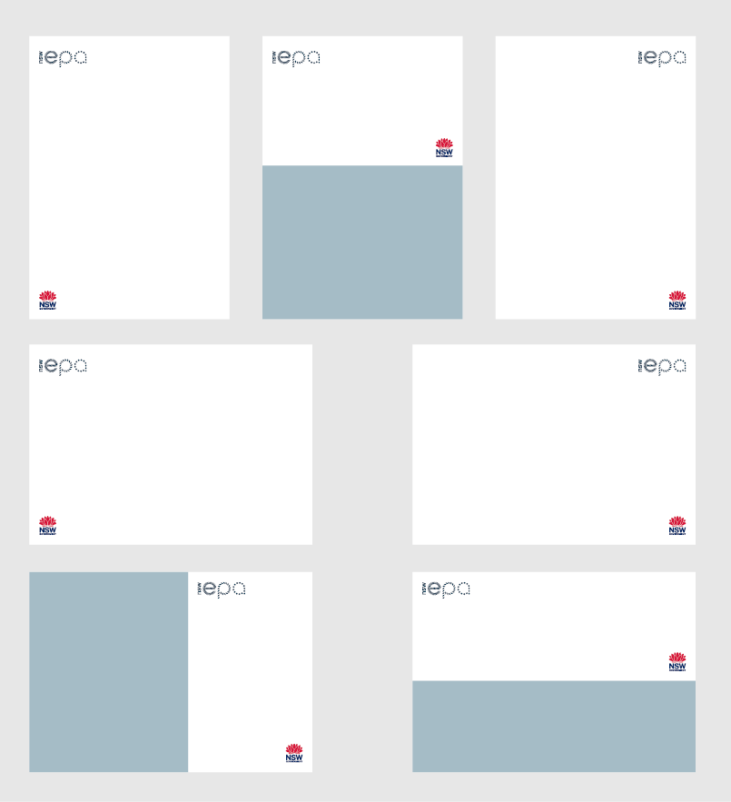
The EPA logo and NSW Government logo both appear on all endorsed applications. In the majority of circumstances these two logos are decoupled, meaning they are not locked up together. The EPA logo should always appear first in the hierarchy and shown as visually larger than the NSW Government logo. In this category, the EPA is the prominent logo so the waratah plays a supporting role.
In applications of the decoupled relationship, the height of the EPA logo is to appear at roughly 90% of the height of the NSW waratah logo. For example, on an A4 layout, we recommend a height of 20mm for the NSW Government logo and a height of 18mm for the EPA logo.
Wherever possible, avoid aligning the EPA logo and NSW Government logo horizontally. If logos must be aligned horizontally, ensure you lock them to opposite margins so they are placed as far apart as possible.
Coupled relationship
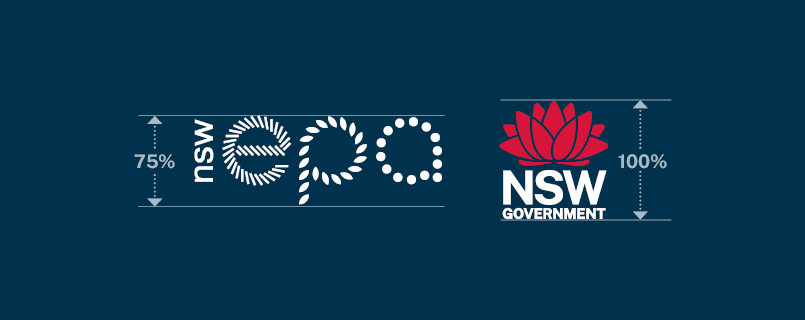
In applications with space restrictions, the EPA logo and NSW Government logo can be coupled together. The EPA logo should come first, and in this instance the logos are used at a visually equivalent size. In applications of the coupled relationship, the height of the EPA logo is to appear at roughly 75% of the height of the NSW Government logo. This should be the exception and is only used in circumstances where it is absolutely necessary.
Full colour coupled logo on a white background

Green and reversed coupled logo on a dark blue background
Reversed coupled logo on a dark blue background

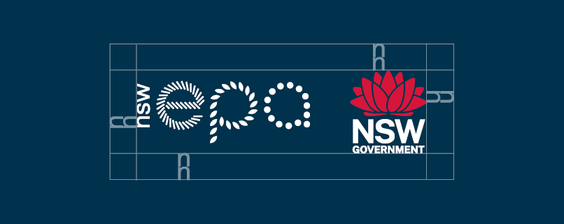
Gap in between logos = 2x width of the ‘N’ from the NSW Government logo
Logos should be vertically centred and separated by the distance of twice the width of the ‘N’ from NSW in the NSW Government logo.

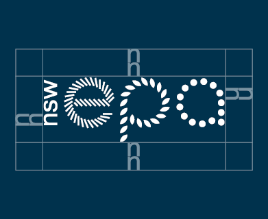
Clear space = twice the “n” height of “nsw” from the EPA logo
Height of the EPA logo is roughly 75% of the height of the NSW Government logo in the coupled relationship
Use of the logo
Access to the EPA logo is available to organisations delivering programs or services in partnership or under sponsorship agreements with the EPA.
Contact [email protected] for approval to use the logo. Use of the logo without prior written approval, or for commercial purposes is considered breach of copyright.
Logo colourways
Our logo has been created in the following colourways and should only be used in the colour combinations shown here.
Dark blue logo on a white background
This logo should only be used on a white or green background.

Green logo on a dark blue background
This logo should only be used on a dark blue background.
White logo on a dark blue background
When the background colour is EPA dark blue, either the green or the white logo may be used.

White logo on a black background
Clear space
To maintain the clarity and integrity of the EPA logo, a recommended clear space of 2xn should be adhered to in all applications. The value is defined by the height of ‘n’ in the logo. Defined clear space should not be encroached on by typography, partnership logos or graphic devices. Wherever possible, apply additional clear space beyond the minimum requirement.
Minimum size
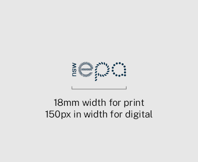
The minimum size usage is 18mm in width for print and 150px in width for digital.
NSW Government logo
The NSW Government logo is inspired by the floral emblem of NSW, the Waratah (Telopea speciosissima). The Waratah has significance in Aboriginal history and was adopted as the state flower in 1962.
Full colour on a white background
Reversed on a dark blue background
Clear space
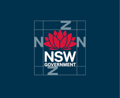
To maintain the clarity and integrity of all brand marks, a minimum clear space must be observed in all applications. Clear space creates an invisible frame that is a minimum area surrounding the brand mark. Wherever possible, apply additional clear space beyond the minimum requirement.
We use a clear space that is 100% of the width of the ‘N’ across all applications (except when used in app icons, or social media profiles).
Minimum size
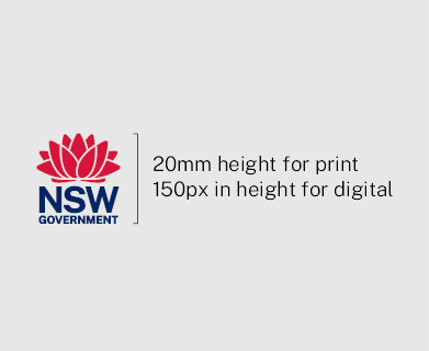
The minimum size usage is 20mm in height for print and 150px in height for digital.
File types
- JPG files have white backgrounds and are supplied in RGB and CMYK. They are suitable for display on web and anything intended for print up to a certain size, for example it may appear pixelated if scaled up for large signage like hoarding or pull up banners.
- PNG files have transparent backgrounds and are supplied in RGB. They are suitable for display on web as well as Word and PowerPoint templates.
- EPS files are supplied in RGB and CMYK and are in vector format which means that it can be enlarged without a loss in quality or resolution and would be appropriate for applications like large signage. EPS can be opened only with specialist software like the Adobe suite. After downloading an EPS file, the extension '.ps' will need to be replaced with '.eps' before it can be used.
Download logos
EPS
EPA logo dark blue RGB
EPA logo green RGB
EPA logo white RGB
EPA logo black RGB
EPA logo dark blue CMYK
EPA logo green CMYK
EPA logo white CMYK
EPA logo black CMYKPNG
EPA logo dark blue RGB
EPA logo green RGB
EPA logo white RGB
EPA logo black RGBJPG
EPA logo dark blue RGB
EPA logo green RGB
EPA logo black RGB
EPA logo dark blue CMYK
EPA logo green CMYK
EPA logo black CMYK